visual identity ↓
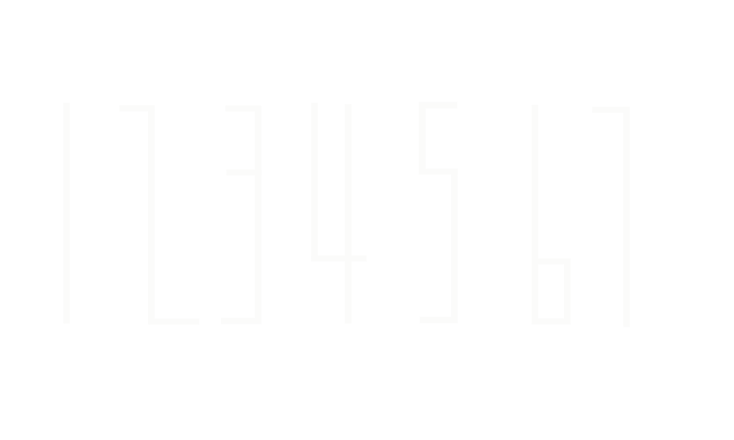
PVC Banner Typeface was chosen for its leanness and curved edges mimicking the Client’s furniture design approach. logo/web layout/signage/brand collateral
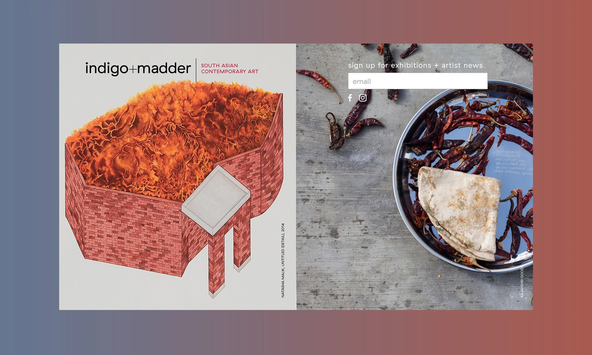
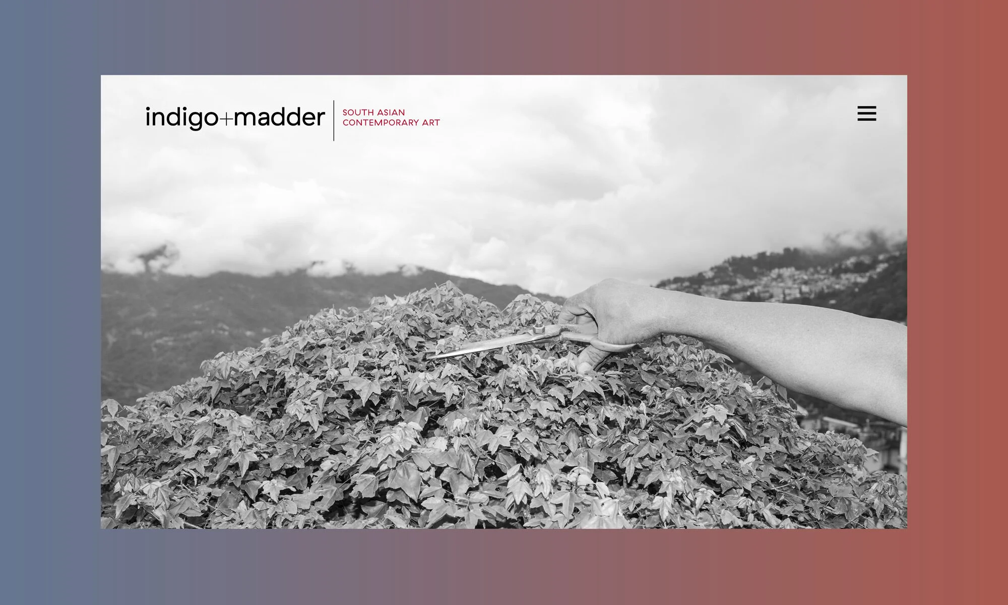
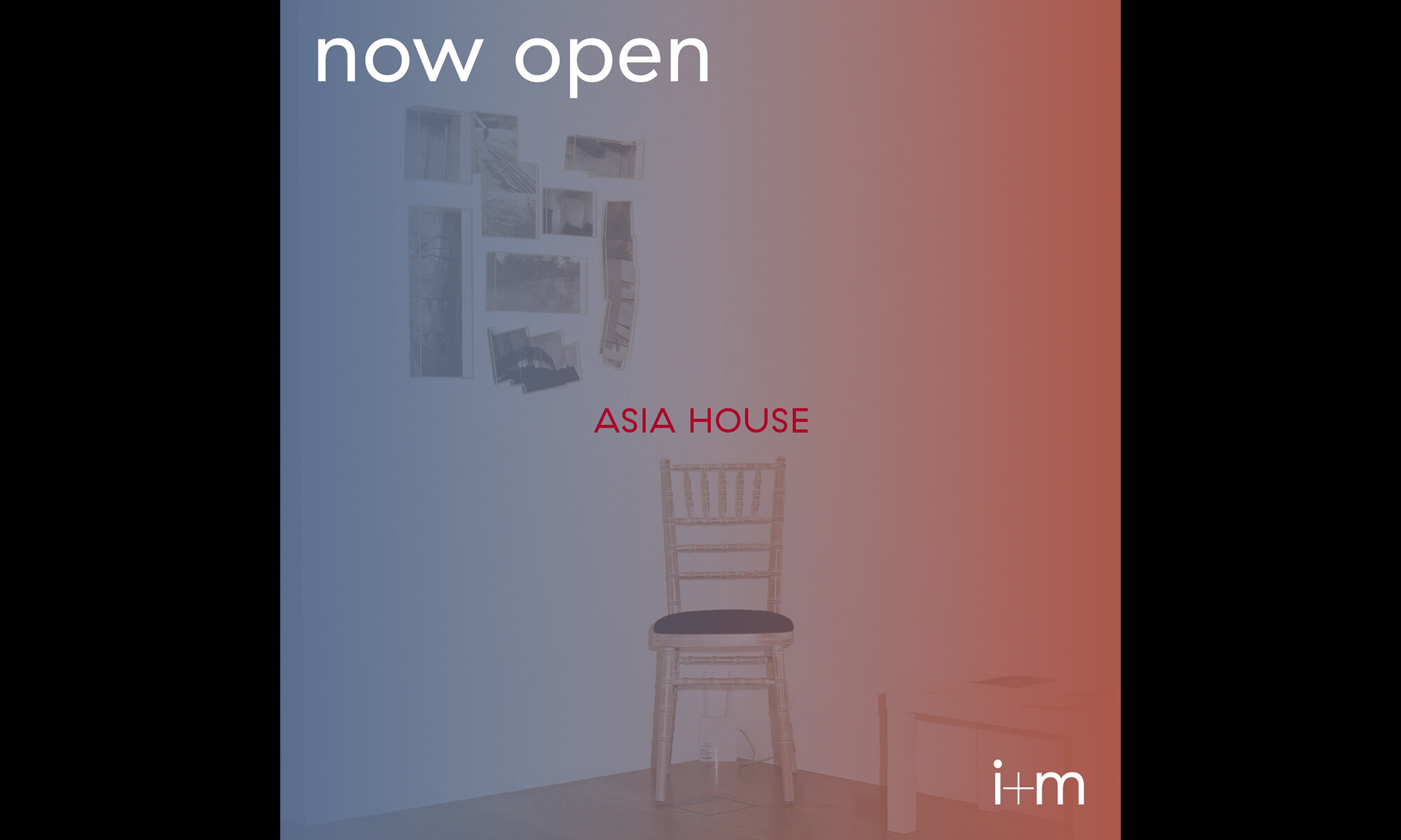
South-Asian gallery challenging preconceived notions of the region’s art. GT Haptik typeface dialogues with London’s contemporary gallery scene. Gradients refer to indigo and madder; a traditional dyeing process from the region.
logo/web layout/exhibition booklets/brand collateral
An independent design studio that “navigates businesses creatively”. Capibara mono light has a retro digital labyrinth feel, aligning with the studio’s pared-back design approach.
logo/website/bs collateral
First personal logo designed, merging the Greek sigma and Arabic ‘B’; a compact symbol of my initials/origins.
logo/bs collateral
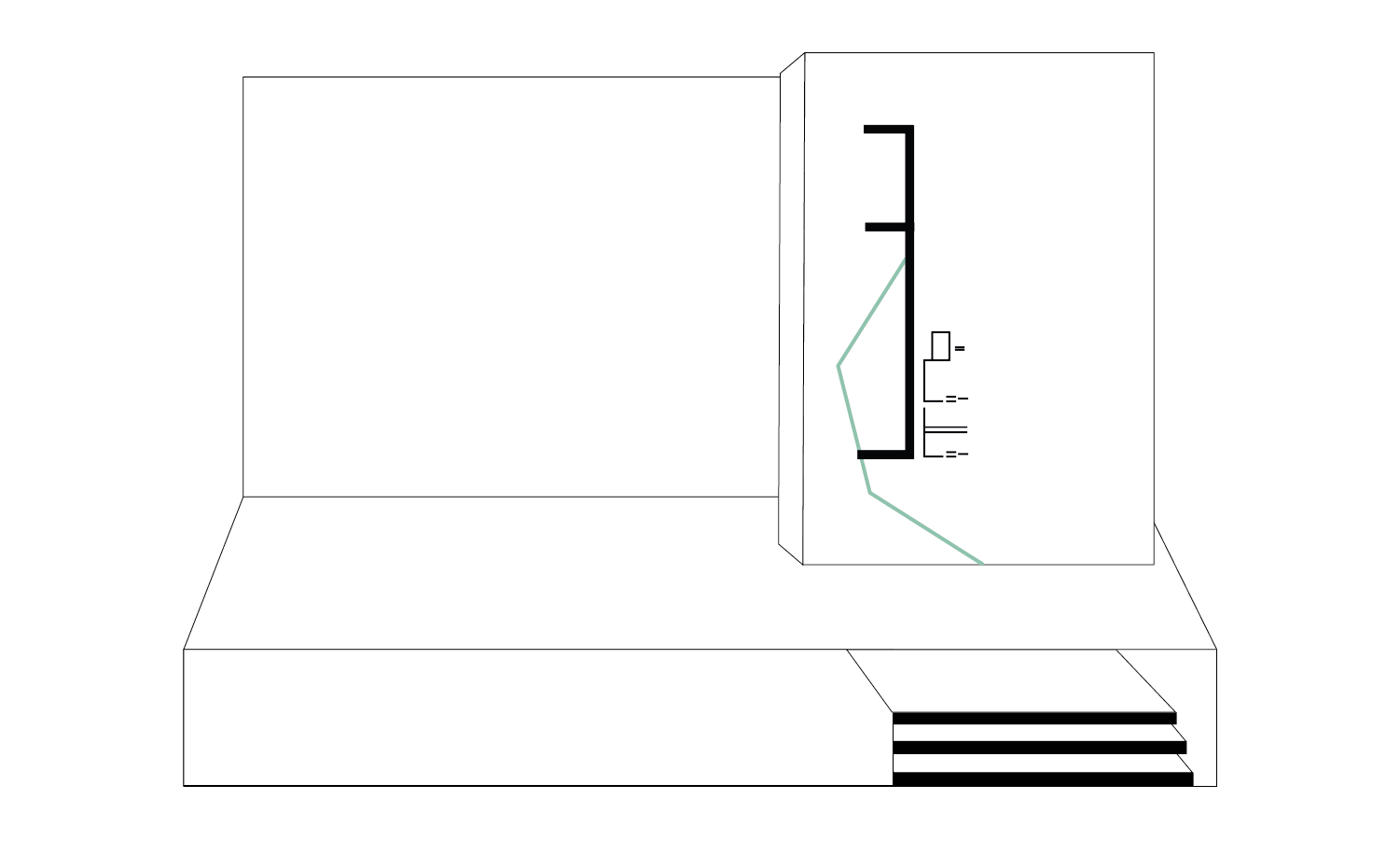
PROPOSED RE-BRAND IS BASED ON DISTINCT ARCHITECTURAL FEATURES – OCTAGONAL SKYLIGHTS THAT RECURS IN A CALM PEPPERMINT TONE ACROSS THE VISUAL LANDSCAPE. A bespoke bilingual geometric typeface harmonises between Arabic and English.
logo/type design/wayfinding
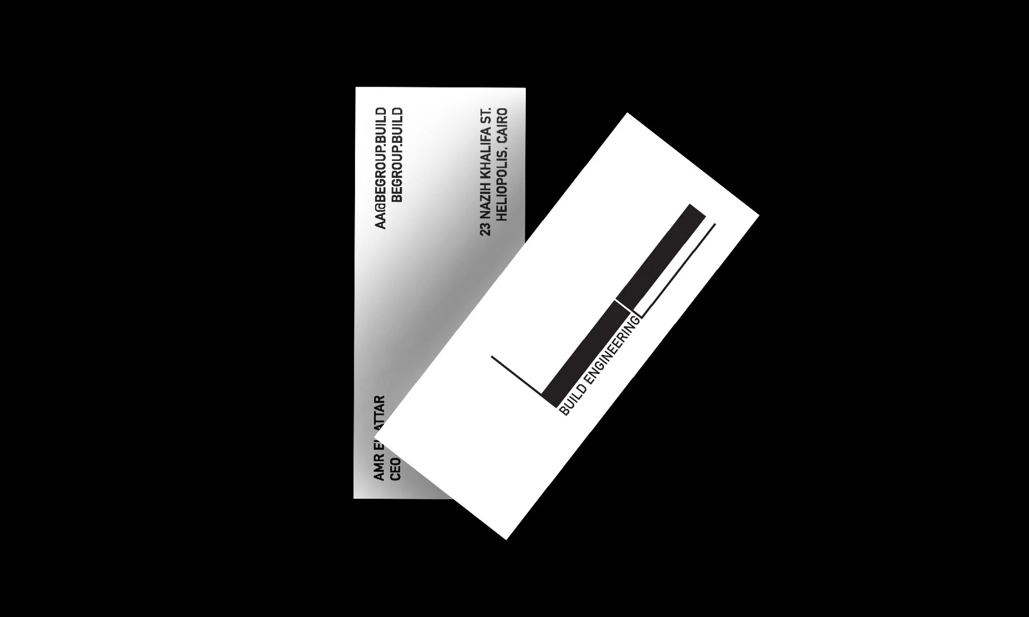
Boutique construction + engineering practice. A linear logo was developed to represent their straightforward, technical approach and lean process.
logo/website/bs collateral
Proposed logo for a boutique high-end consultancy. George Display typeface was picked for its playful characteristics, an oversized C, and a bulging A, to imply a light-hearted luxury tone.
concept logo
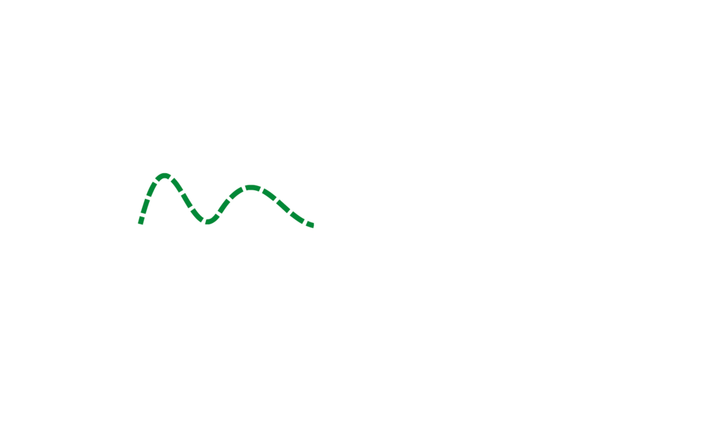
Middle East outdoor/adventure trip service. ‘Magra al haya’ derives fr’. The fluid ‘m’ denotes trail marks on a map’s terrain and changes colour according to the trip type.
logo/bs collateral